Pareto chart - 80 20 rule
- Home >
- articles >
- maintenance-management >
- pareto charts 80 20 rule
What is a Pareto Chart & the 80 20 Rule?
Video: What is a Pareto Chart
What is a Pareto Chart?
Definition:
- Pareto Chart
- A vertical bar graph in which values are plotted in decreasing order of relative frequency from left to right, with intent to bring focus on the top 20% of causes that result in 80% of undesired events.
Pareto charts are a tool to apply and analyze Vilfredo Pareto's Pareto Principle based on his 80 20 observations, and variations of that original 'rule'. (See more details below in the "What is the 80 20 rule?" section below.) It is also common in the textbook definition to additionally have an overlapping line graph representing cumulative total percent. Percentage of the total number of incidents secondary vertical (value) axis labels would be on the right side of the graph if an additional line graph is added. See textbook Pareto Chart example below...
The Pareto charts (Also called Pareto distribution diagram) first used by economist to explore the observation that 20% of a country's population, own 80% of the wealth. While Pareto deserves equal credit for bringing the wealth gap to light, the chart and principle were later adapted for quality improvement and management, using both for problem-solving. The Pareto principle has been found to apply in many aspects of life.

Note: The video above and this article are to supplement the "Workplace Problem Solving Skills Training DVD". (Which is part of the XTreme Lean training series of DVDs.) This article can also be used to supplement the "True Downtime Cost"™ book.
What is the 80 20 rule (Pareto's Principle)?
Definition:
- 80 20 rule
- Economics: The original Pareto observation, about the distribution of a country's wealth. Pareto found 20% of a country's population controlled 80% of the country's wealth. Pareto's observation of inequality is consistent on a global scale too. IE: "What is Pareto's law?"
Quality: The observation that about 20% of the causes (measures frequency), results in about 80% of your defects.
Problem Solving: The observation that about 20% of the causes (frequency), results in about 80% of the problems. For example, 20% of root causes result in 80% of downtime.- Management: The observation that 20% focus of your efforts will result in 80% of your desired outcomes. For example, 20% of your customers generate 80% of your revenue.
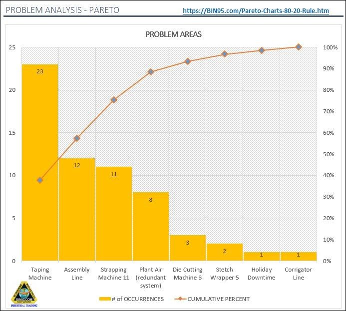
First, a couple of facts you will not see mentioned much in the literature about the '80/20 rule', first it is not a rule, it is an observation. The percentages can, and often do vary. The Pareto Chart Example above measuring frequency of downtime in 8 areas, shows the top 3 (57.5%) have 75.41% of the total number of breakdowns in 8 cost centers monitored. The Pareto Principle that the few affect the many still holds true. Just not exactly 80/20. If the chart analyzed all 15 cost centers, then those same 3 areas would be closer to 20% causing 80% of the breakdown occurrences. What is important, is to apply the Pareto Principle to first focus your attention on the few that will yield the greatest results.
The second fact which you most likely never heard someone mention is there is a correlation between the Pareto Principle and human interaction. Things like a result of human error, human judgment, etc. For example, 80% of network security compromises are human interaction related. So, one can derive the more automated a system, machine, process; the less applicable the Pareto Chart/Principle may be as an analysis tool. Just some insight into your thinking, now let's explore Pareto Analysis some more.
Pareto Analysis Example:
In the textbook, Pareto Chart Example at the top of this page, the frequency of breakdowns is used. In that Pareto chart, it shows the simple hand-held tape machine has the bulk number of breakdowns. One might not know by the limited information of the chart, that the tape machine is only down for a minute at a time, only cost about $1.60 each time. If they are taking the Pareto chart's initial intent at face value, without applying their problem solving skills, they may choose only the number of breakdowns to prioritize their focus and efforts on. Applying problem-solving skills, one might reason tracking time, instead of occurrences would be more valuable as a monitored metric. A machine or line may have fewer downtime occurrences, but be down for multiple hours each time. Therefore, after further thought, one may arrive at the conclusion, looking for the machines with the most downtime would be more relevant.
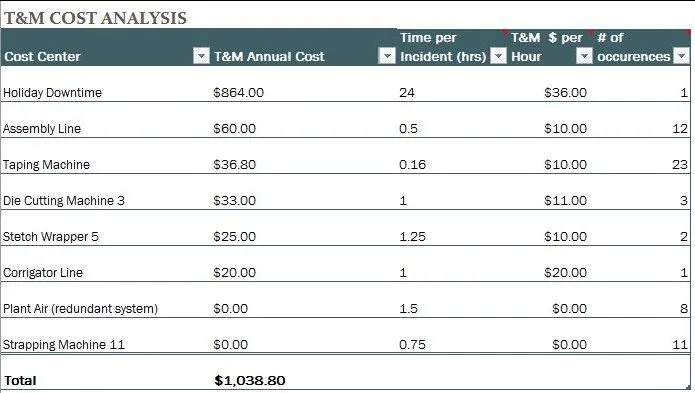
But those in the process and manufacturing industry know different machines have different downtime costs and effects on the process, or plant as a whole. The most widely used costing method is time and material (T&M) cost. So below is a T&M Pareto chart example analyzing the same group of machines. Notice how in the chart below, we see besides holiday downtime cost, the assembly line has the most potential cost savings, not the taping machine.
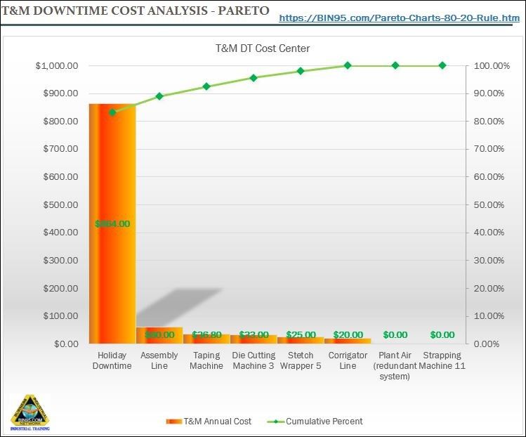
(Tap Pareto chart to zoom, hover data table.)
TDC Pareto Analysis Example:
While the T&M Pareto analysis utilizes one's problem-solving skills and is the most common approach, it still does not point the user to the area of greatest improvement opportunity. Why? Because critical thinking was not applied. IE: keeping an open mind to all considerations and details before coming to a conclusion. Just because it is a standard or the way most do it, does not necessarily make it the best way. T&M is for the most part just apply time. To see the true cost, we want to use true downtime cost™ (TDC) so we can better see what is impacting our bottom line the most. Below is an example of a TDC Pareto chart.
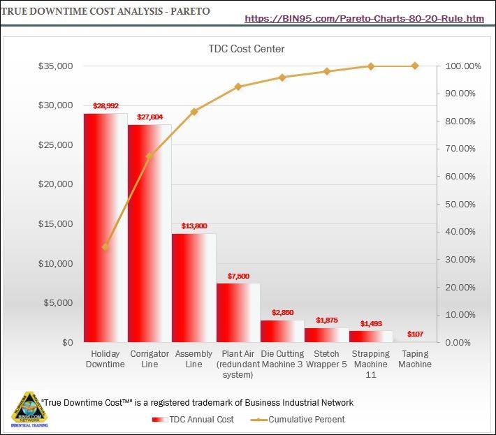
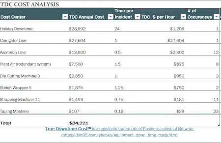
(Tap Pareto chart to zoom, hover data table.)
Notice in the TDC Pareto chart above, using True Downtime Cost™, the Corrugator (a bottleneck to the plant) is revealed as most costly. Next to the holiday shutdown anyway, which is planned downtime. You see the taping machine become the one deserving the least attention and resources now. TDC improves the accuracy of critical assignments too. In complex companies of today, often the greatest opportunity is not always as clear as a bottleneck is. Which makes Pareto analysis understanding and importance all that much more important. When using Pareto charts, choose your metric wisely, using all your problem-solving skills and critical thinking. TDC is representative of profit/loss, making TDC a great Key Performance Indicator (KPI) for your Pareto charts.
To download a supporting Pareto chart excel format & PDF copy of this article, see Pareto Chart Excel
Other problem solving techniques and tools are explored in our Problem Solving Skills Training DVD.
TDC - "True Downtime Cost"™ - Is a registered trademark of Business Industrial Network (BIN95.com)
Copyright © 2018 - Business Industrial Network and https://bin95.com. All rights reserved.
Although, we do encourage you to share a link to this article, as the more who read it, the safer we all will be.
This article "What is a Pareto Chart & the 80 20 Rule?" covers the Pareto chart, 80 20 rule, Pareto principle, and Pareto analysis. This article is also great for the person wanting to know more about what is the 80 20 rule. Some deep learning too of how to create a Pareto chart.
All trademarks and trade names are property of their respective owners.